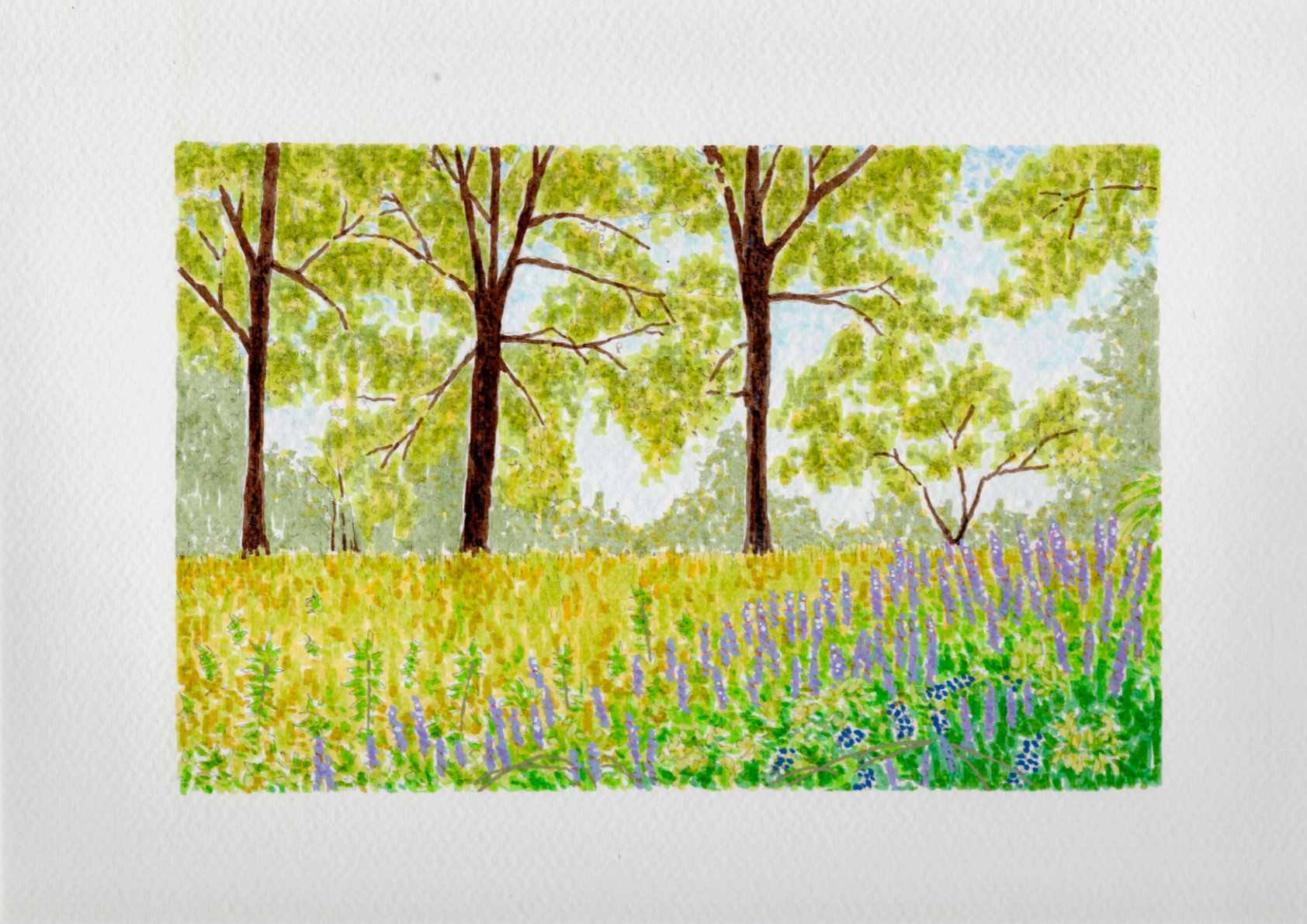
This study captures a spring field in Georgia, where the greens and yellows feel like they arrived overnight. I used India ink to build the colors in layers, following an Impressionist approach where the depth emerges slowly through repeated marks rather than solid lines. Against that translucent ink, I used acrylics sparingly as a solid, opaque counterpoint.
I applied them specifically to the purple vetch in the foreground and a few select leaves to give the eye a place to land. The cold press paper captures and holds the ink exactly where I want it, keeping the pigment in place while allowing just the smallest edges to blend into the tooth. It’s a fast, rhythmic way to work that records the spirit of the place without getting bogged down in every individual blade of grass.
Reply